Getting Started
In this article, we will go over several use cases for DODO's Swap Widget.
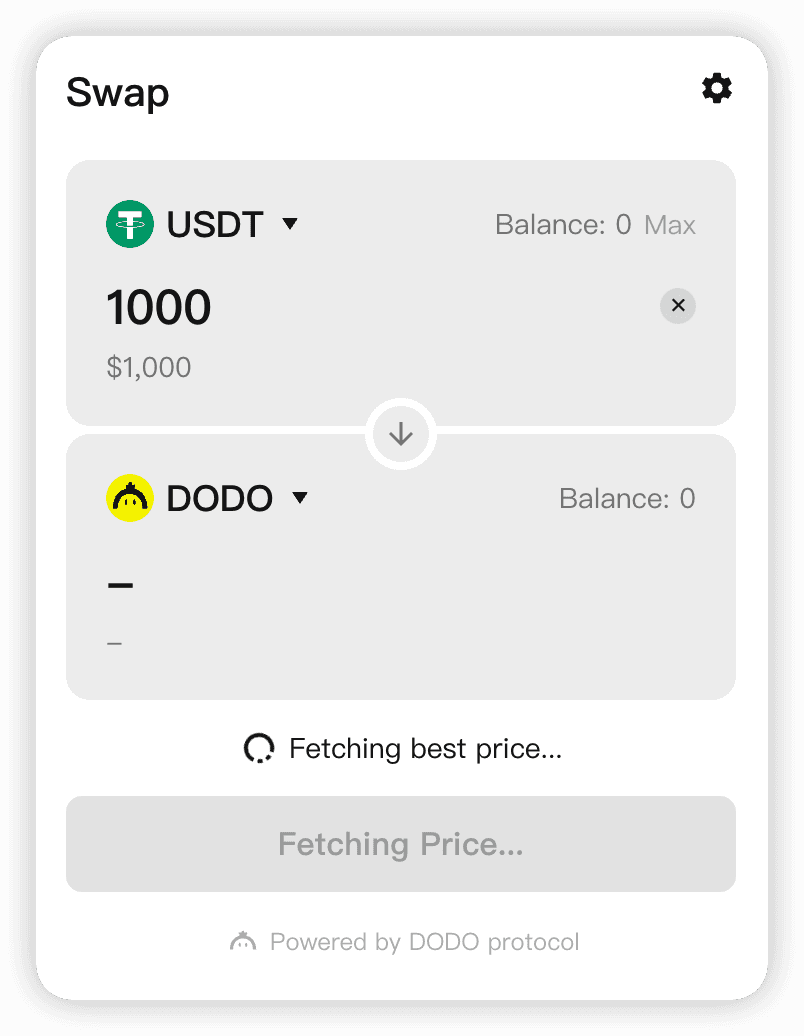
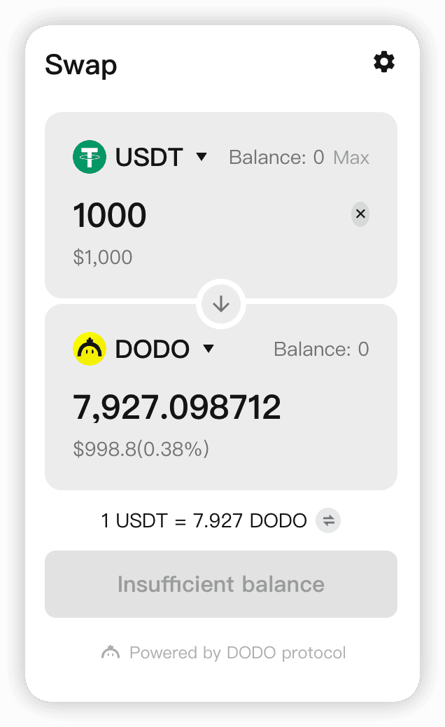
Using the Swap Widget#
To use the widget, the 'widgets' library must first be made accessible to the user, either by installing it locally with 'yarn', or by importing it in a TypeScript code file.
Install#
yarn add @dodoex/widgetsImporting (React Project)#
import { SwapWidget } from "@dodoex/widgets";

function App() {
  return <SwapWidget />;
}
Importing (Angular Project) #
/**
 * Angular Component ts file
 * Initialize SwapWidget
 */

import { Component, OnInit } from "@angular/core";
import { InitSwapWidget } from "@dodoex/widgets";

@Component({
  selector: "app-widgets",
  templateUrl: "./widgets.component.html",
  styleUrls: ["./widgets.component.scss"],
})
export class WidgetsComponent {
  ngOnInit() {
    InitSwapWidget({
      colorMode: "dark",
      // apikey: '55ea0a80b62316d9bc', // for default test
    });
  }
}
<!-- Angular Component html file -->
<div class="widget-container">
<div id="dodo-swap-widget"></div>
</div>Importing (JS Project)#
/**
 * main.js
 * Initialize SwapWidget
 */

"use strict";
import { InitSwapWidget } from "@dodoex/widgets";

function initDodoWidget() {
  InitSwapWidget({
    colorMode: "dark",
    // other apis
  });
}

initDodoWidget();
<!-- index.html -->
<head>
<script defer="defer" src="main.js"></script>
<head>
<!-- Add tag with id dodo-swap-widget under body -->
<body>
<div id="app">
<div id="dodo-swap-widget"></div>
</div>
</body>
</head>
</head>Connect to a Wallet#
The configuration of the currently supported chains can be viewed here[add new link]. You can also use the Swap Widget's built-in wallet connection module directly.
RPC Node Configuration#
To customize the node configuration, run jsonRpcUrlMap, as shown below. You can also decide to use the default configuration.
import { SwapWidget } from '@dodoex/widgets';

function App() {
    return (
        <SwapWidget
            jsonRpcUrlMap={{
              1: [
                'https://rpc.ankr.com/eth',
                'https://eth-mainnet.public.blastapi.io',
                'https://eth-rpc.gateway.pokt.network',
                'https://main-rpc.linkpool.io',
              ],
              ...
            }}
        />
    )
}
Default Chain Configuration#
When using the Swap Widget's own wallet link, you may need to specify the default chain, which defaults to 1 if not specified. If the default chain is specified, and the connection turns out to be using MetaMask, you will be prompted to switch to your specified chain.
import { SwapWidget } from "@dodoex/widgets";

function App() {
  return <SwapWidget defaultChainId={1} />;
}
Customize the Swap Widget#
We support the following Swap Widget customizations:
Customize Height and Width#
Swap Widget's default width is set to 375px, and the default height is 494px, which are the dimensions of the Swap Widget if the width and height parameters are not customized. You can set the width and height to customize the display of the container according to your needs. The display elements automatically adjust based on the
In order to adapt to different models and to avoid a misleading interface, the minimum width the interface can be set to is 292px, and the minimum height is 494px. If the height and width are set smaller than the minimum width and height, the change will not take effect.
If height and width were set innumber ,it would turn into px display. The string can be set to any of the CSS attributes.
import { SwapWidget } from "@dodoex/widgets";

function App() {
  return <SwapWidget width={360} height="80vh" />;
}
Customize Fonts#
Swap Widget uses mui/system to establish the theme. Set the parameters in theme to set the font, as shown below.
import { SwapWidget } from "@dodoex/widgets";

function App() {
  return (
    <SwapWidget
      theme={{
        /** font*/
        fontFamily: [
          "Manrope",
          "Poppins",
          "Inter",
          "PingFangSC-Regular",
          '"Microsoft YaHei"',
          "sans-serif",
        ].join(","),
        /** title */
        caption: {
          fontSize: 20,
          fontWeight: 600,
          lineHeight: "28px",
        },
        /** body text */
        body1: {
          fontSize: 16,
          lineHeight: "22px",
          fontWeight: 400,
        },
        /** secondary text */
        body2: {
          fontSize: 14,
          lineHeight: "19px",
          fontWeight: 400,
        },
        /** smaller pop-ups */
        h6: {
          fontSize: 12,
          lineHeight: "17px",
          fontWeight: 400,
        },
        /** button's configuration */
        button: {
          fontSize: 16,
          lineHeight: 1,
          fontWeight: 600,
        },
        // ... Currently the above have been used, continue to add more if needed
      }}
    />
  );
}
Customize Theme#
There are currently two themes, light and dark. When the mode is specified, theme.palette can be run to override the theme color. Note, the code only works when theme.palette.mode = mode. An example of this usage is shown below.
import { SwapWidget } from '@dodoex/widgets';

function App() {
    return (
        <SwapWidget
            colorMode="light"
            theme={{
                palette: {
                  // light | dark
                  mode: 'light',
                  primary: {
                    // main color
                    main: '#1A1A1B',
                  },
                  secondary: {
                    // secondary color(used for buttons or some window‘s background colors)
                    main: '#FFE804',
                    contrastText: '#1A1A1B',
                  },
                  error: {
                    main: '#EC5A7D',
                    contrastText: '#FFFFFF',
                  },
                  warning: {
                    main: '#B15600',
                    contrastText: '#1A1A1B',
                  },
                  success: {
                    main: '#2FBA90',
                    contrastText: '#1A1A1B',
                  },
                  purple: {
                    main: '#6851B4',
                    contrastText: '#1A1A1B',
                  },
                  background: {
                    default: '#F9F6E8',
                    paper: '#FFFFFF',
                    paperContrast: '#F6F6F6',
                    backdrop: 'rgba(0, 0, 0, 0.9)',
                    input: '#F0F0F0',
                    tag: 'rgba(26, 26, 27, 0.1)',
                  },
                  text: {
                    primary: '#1A1A1B',
                    secondary: 'rgba(26, 26, 27, 0.5)',
                    disabled: 'rgba(26, 26, 27, 0.3)',
                    placeholder: 'rgba(26, 26, 27, 0.3)',
                    link: '#1A1A1B',
                  },
                  border: {
                    main: 'rgba(69, 72, 81, 0.1)',
                    light: 'rgba(26, 26, 27, 0.3)',
                    disabled: 'rgba(26, 26, 27, 0.1)',
                  },
                  hover: {
                    default: 'rgba(26, 26, 27, 0.04)',
                  },
              },
            }}
        />
    )
}
Customize Style#
Many designers use GlobalStyles from mui/system to set the overall style, however, we recommend using theme.components.MuiCssBaseline.styleOverrides to override the style if needed.
import { SwapWidget } from "@dodoex/widgets";

function App() {
  return (
    <SwapWidget
      colorMode="light"
      theme={{
        components: {
          MuiCssBaseline: {
            styleOverrides: {
              "::-webkit-scrollbar": {
                width: 6,
                backgroundColor: "transparent",
              },
              "::-webkit-scrollbar-thumb": {
                backgroundColor: palette.border?.main,
                borderColor: palette.border?.main,
                borderRadius: 100,
              },
            },
          },
        },
      }}
    />
  );
}
t;
Or simply use CSS, as shown below.
.dodo-widget-container {
  //... css code
}
Customize Token List
Specify details in tokenList to override the default Token List. The default Token List's configuration can be found here.
import { SwapWidget } from '@dodoex/widgets';

function App() {
    return (
        <SwapWidget
            tokenList={[
                {
                    chainId: 1,
                    address: '0xEeeeeEeeeEeEeeEeEeEeeEEEeeeeEeeeeeeeEEeE',
                    name: 'Ether',
                    decimals: 18,
                    symbol: 'ETH',
                    logoURI:
                      'https://image-proxy.devus.dregon.cc/9EZYMDGfU7x67vAe8jZE1g04DLThXZWBHoOpdXiyxGE/aHR0cHM6Ly9jZG4tbWVkaWEuZG9kb2V4LmlvL2VyYzIwL2h0dHBzX3MyX2NvaW5tYXJrZXRjYXBfY29tX3N0YXRpY19pbWdfY29pbnNfNjR4NjRfMTAyN18xMzI2N2FlNDcwLnBuZw.png',
                },
                ...
            ]}
        />
    )
}
Customize Popular Token List#
You can customize the popularTokenList parameter, using the same format as tokenList. The tokens will be displayed on the list of popular tokens, making them easier to access.
import { SwapWidget } from '@dodoex/widgets';

function App() {
    return (
        <SwapWidget
            popularTokenList ={[
                {
                    chainId: 1,
                    address: '0xEeeeeEeeeEeEeeEeEeEeeEEEeeeeEeeeeeeeEEeE',
                    name: 'Ether',
                    decimals: 18,
                    symbol: 'ETH',
                    logoURI:
                      'https://image-proxy.devus.dregon.cc/9EZYMDGfU7x67vAe8jZE1g04DLThXZWBHoOpdXiyxGE/aHR0cHM6Ly9jZG4tbWVkaWEuZG9kb2V4LmlvL2VyYzIwL2h0dHBzX3MyX2NvaW5tYXJrZXRjYXBfY29tX3N0YXRpY19pbWdfY29pbnNfNjR4NjRfMTAyN18xMzI2N2FlNDcwLnBuZw.png',
                },
                ...
            ]}
        />
    )
}